SF-EXPRESS Special delivery
DATA VISULIZATION
UI & animation DESIGN
OVERVIEW
Special Delivery is a special line developed by SF Express for some special categories of commodities or commodities in special regions, such as hairy crab express, international express, etc.During the project, hairy crabs were used as an example for design.

analyze
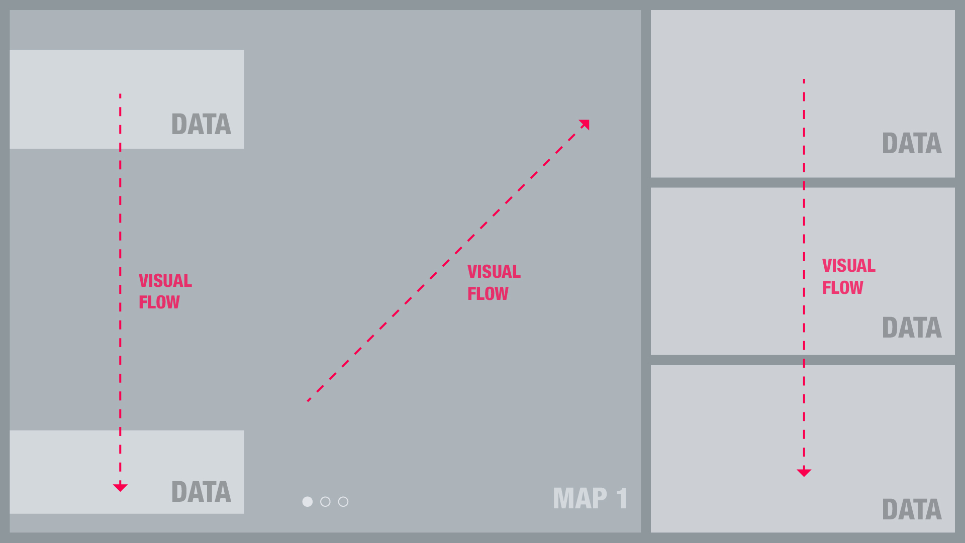
Based on the original charts, we reorganized and optimized it from aspects such as reading flow, layout, color and data display effect.
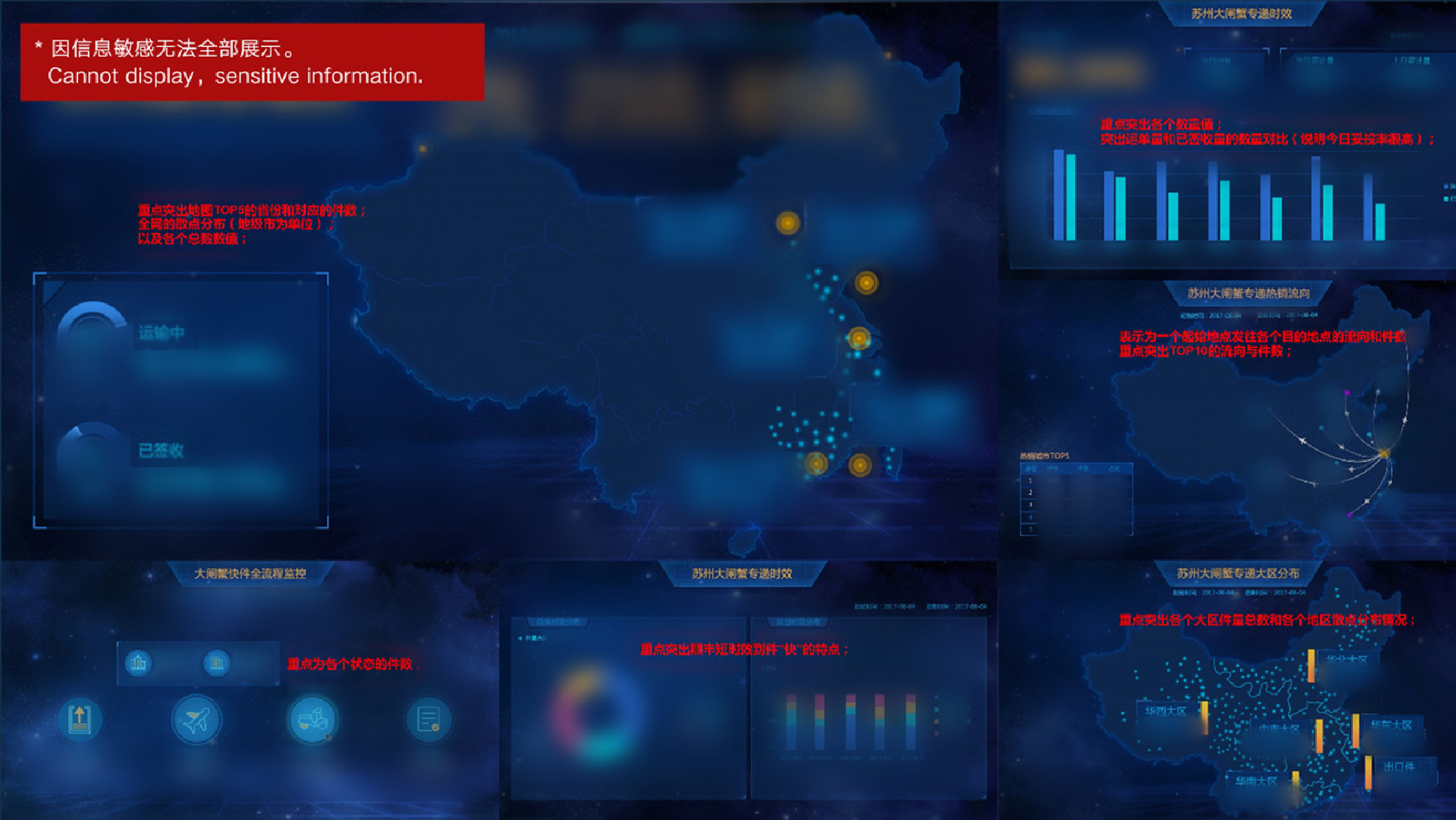
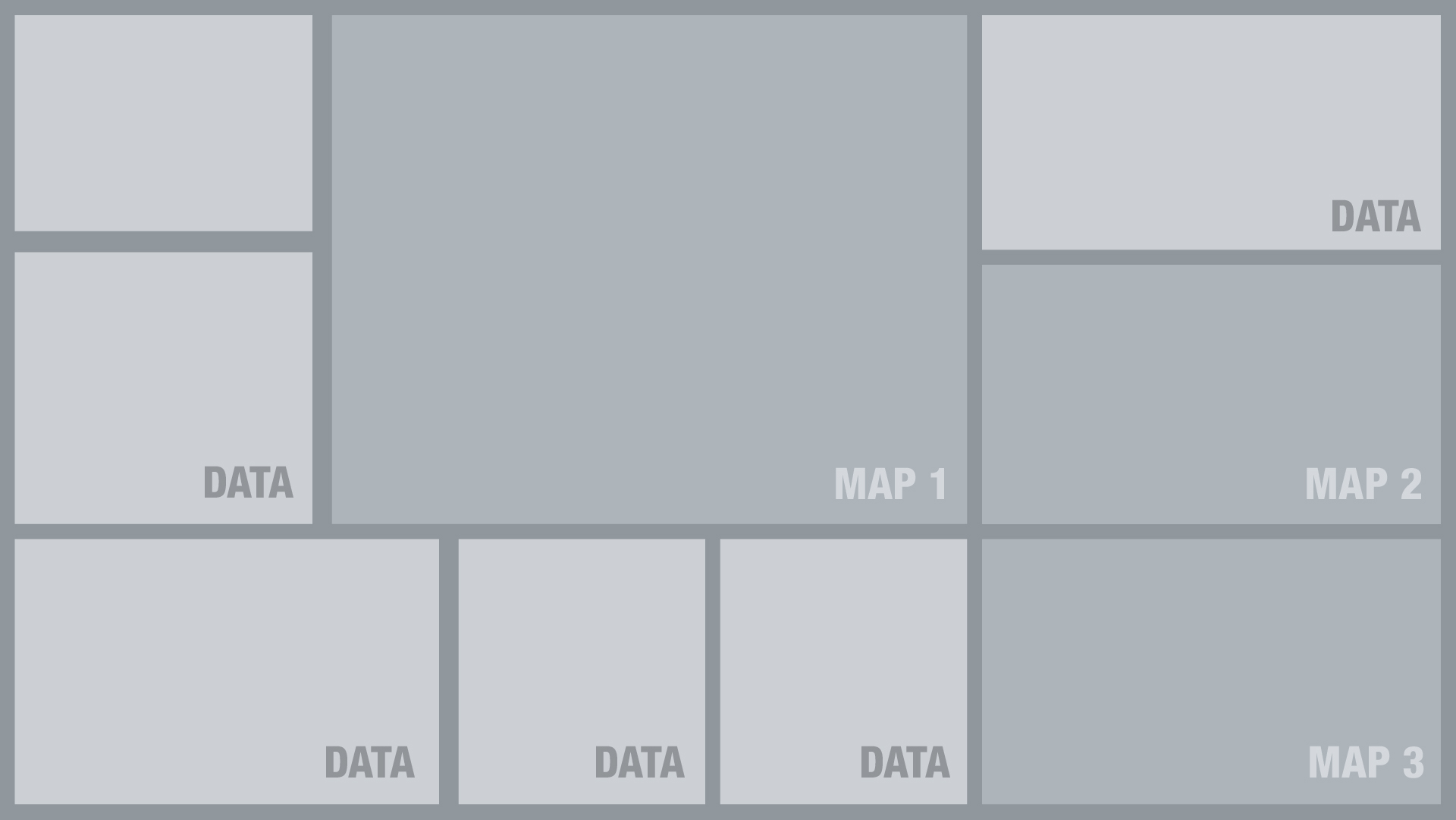
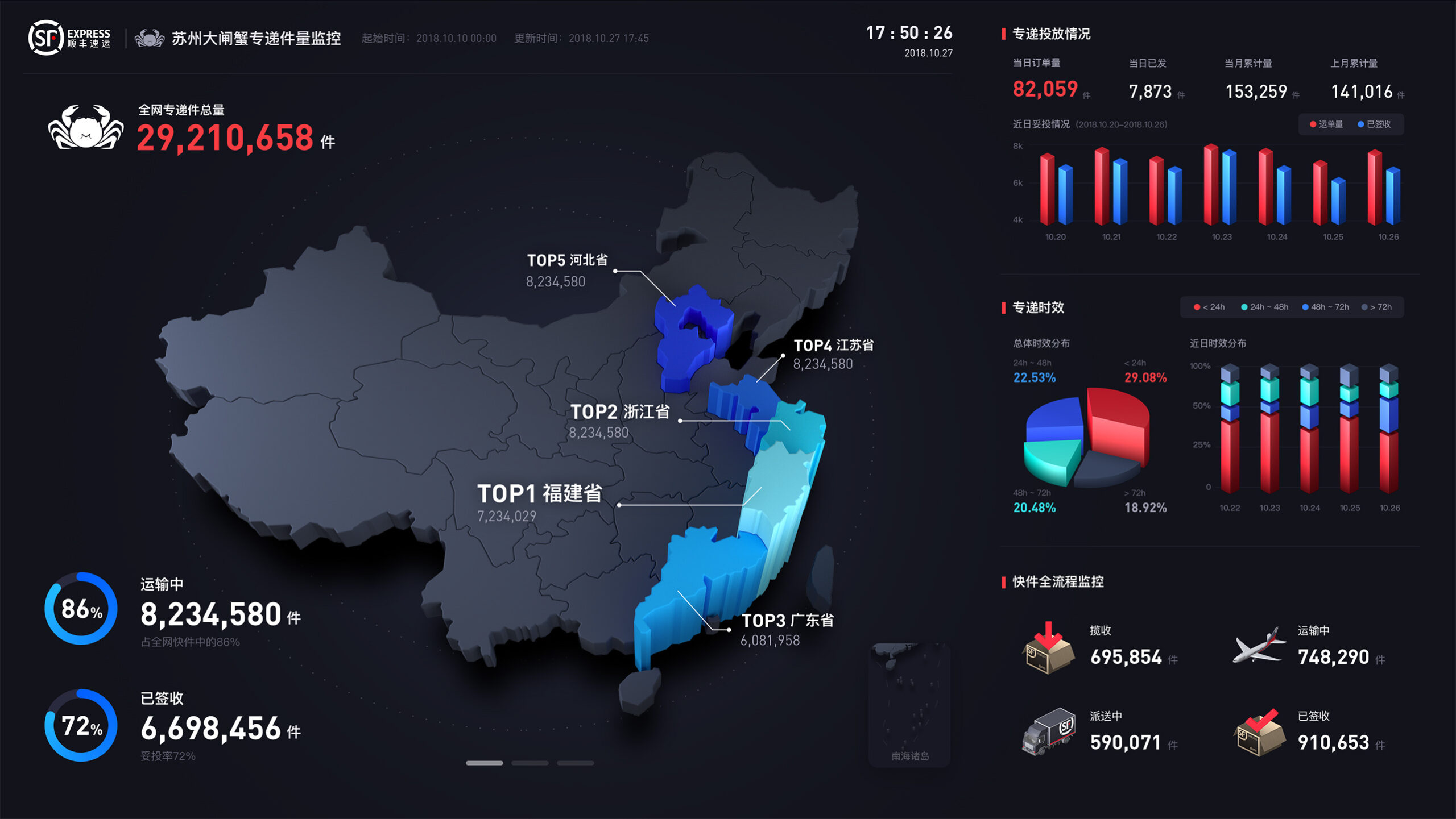
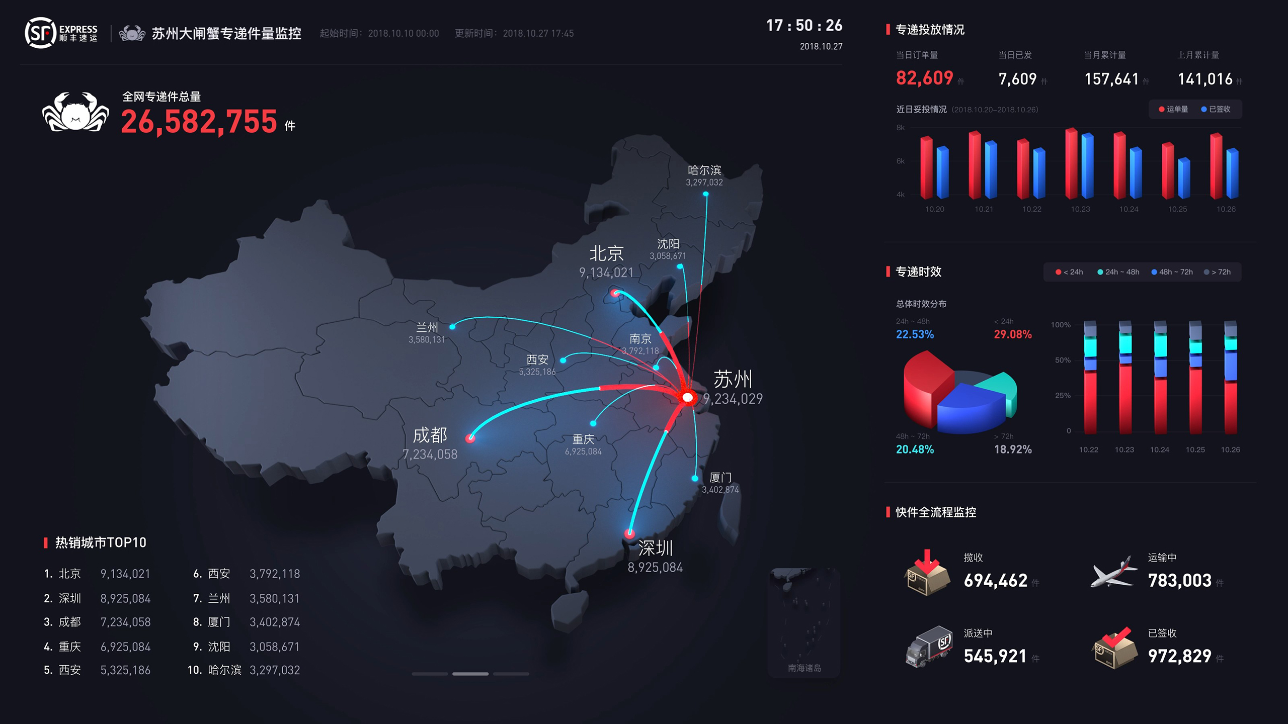
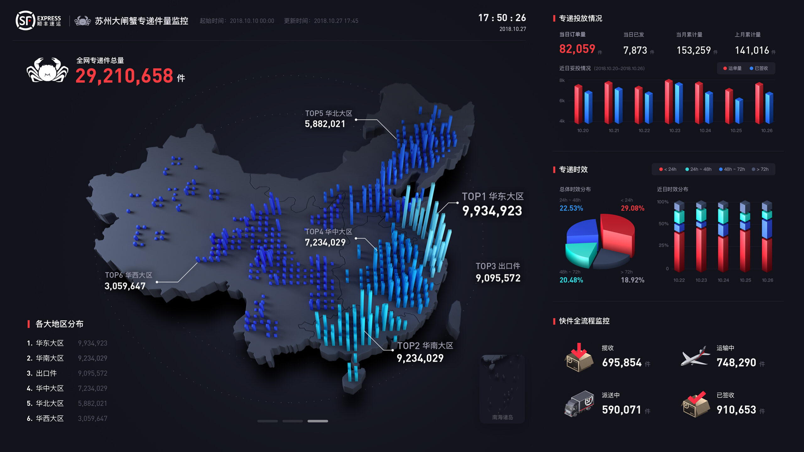
We organize the information, merge similar items, and rearrange them according to priority: Integrate the original three map data into one large map data, and use the carousel method to display it, saving screen space and making the layout more organized.
first demo
We try some cool effect on the first demo, using lots of translucent texture to attract people.

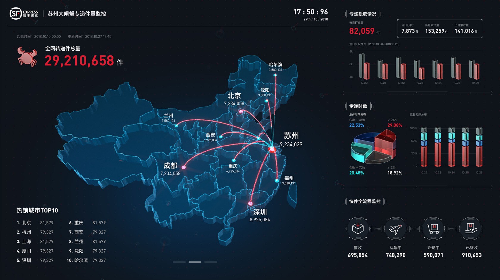
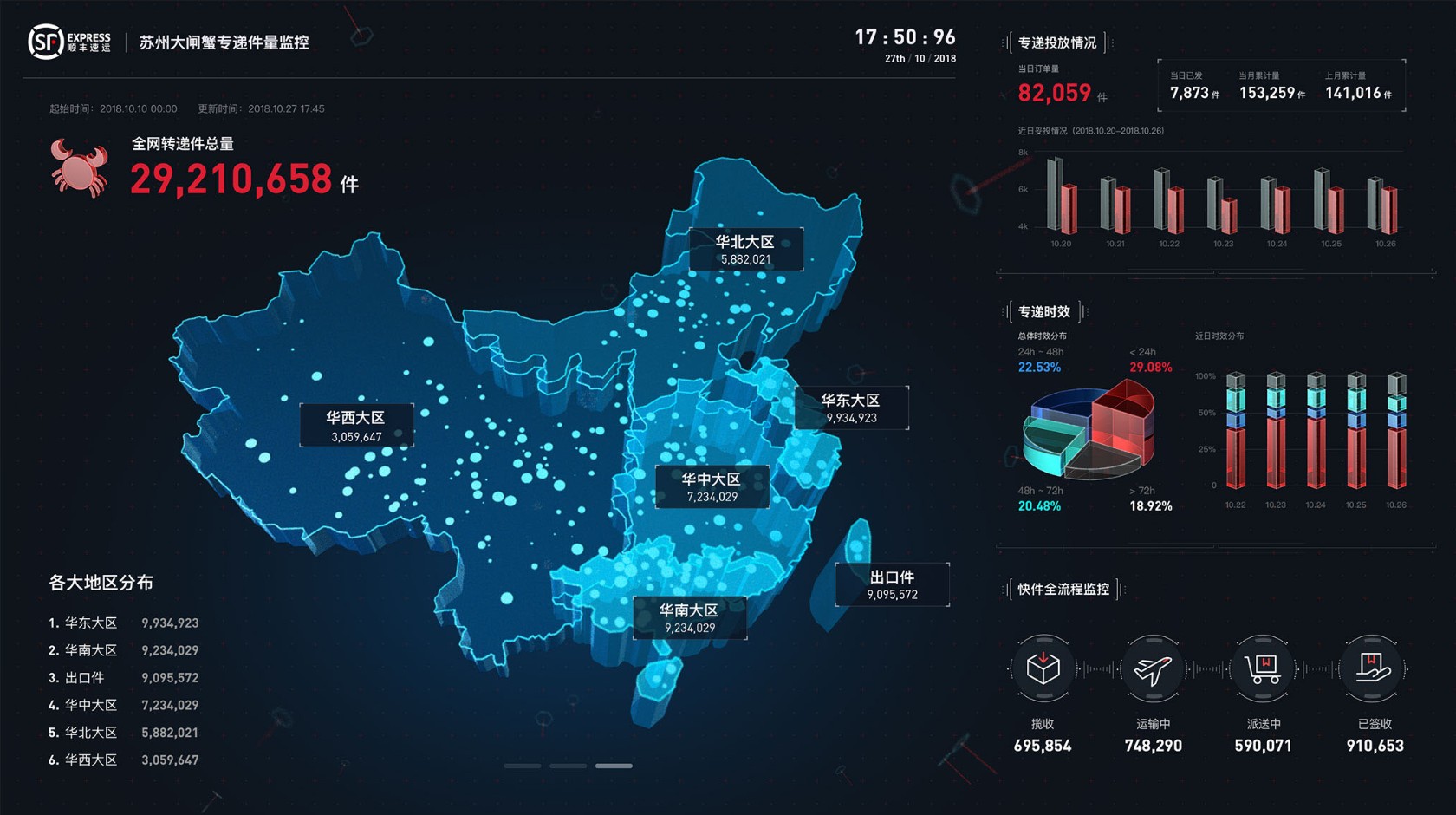
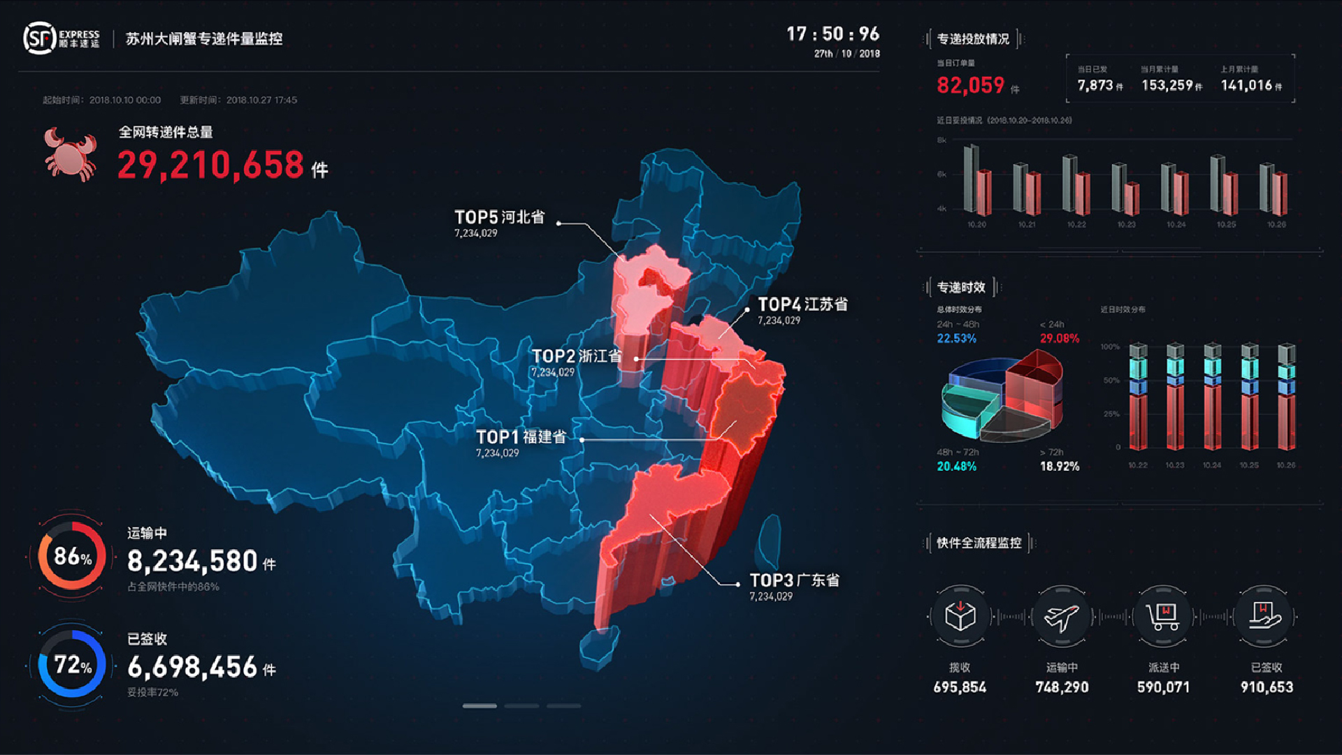
The overall design has many auxiliary details, hoping to increase the technological sense of the real-time data screen. This design actually pays more attention to practical effects. Although the translucent effect is cool, the recognition of graphic data is low, and long-term observation is more likely to cause visual fatigue. After everyone’s discussion, we finally unanimously decided to adopt a more “realistic” 2.5D style to solve the current problems.
Final edition
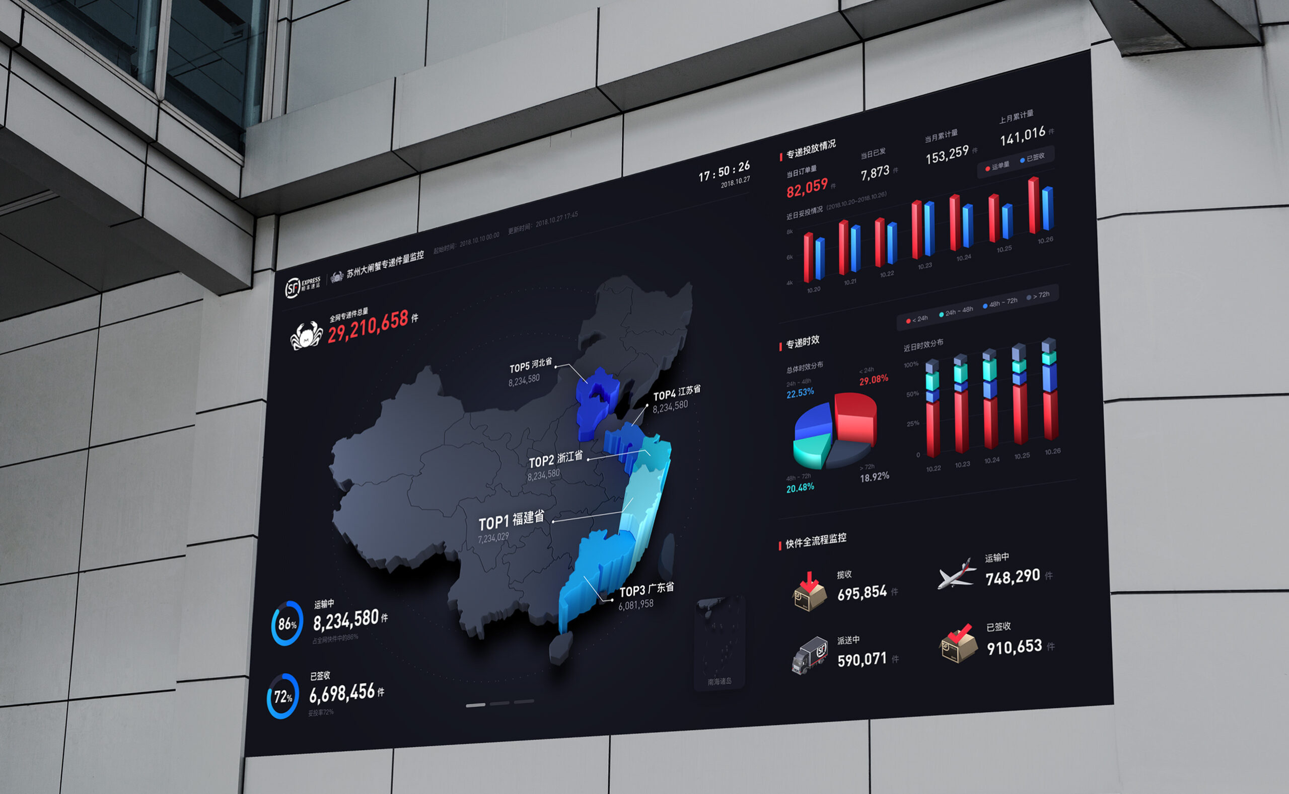
A more flat and clean style is used to realize the final data visualization, so that people will not feel tired after looking at it for a long time. (All the following data are fictitious)
